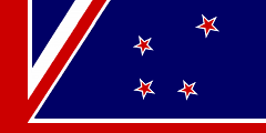
tl;dr — The upright cross is not worth having, but turned through 180 degrees, Crux becomes rich with NZ symbolism.
Failure by Stealth
The current NZ flag is easily improved upon.
But I’m pessimistic about the public’s ability to choose a really good one, partly because they might not be given the option. I anticipate that many designs will defer to existing conventions without thinking them through, and the Selection Panel will play along.
While the flag raises numerous design dilemmas (and I have opinions on many), I think the biggest risk of unwitting blunder concerns the Southern Cross.
Many design proposals use the Southern Cross as ready-made decoration, and the Panel will offer at least one to the public vote. But if familiarity is the designer’s main justification, they will not consider remaking it as something new.
Symbolism and Distinctiveness
The “Southern Cross” of our current flag is no more than a graphical replacement for the previous “NZ” defacement; an arbitrary marker.
It is certainly not distinctive (Wikipedia).
It must therefore be vested with uniquely NZ meaning to justify its use, otherwise it is purely decorative.
But its justification is insipid:
- It means South … But only loosely, considering it’s visible from most of the Earth’s surface, including much of the Sahara Desert for example.
So it doesn’t mean anything, either.
Advice:
I think there’s only one way to use Crux in a symbolically valid and distinctive way, and that is by rotating it.
-
- This forms the shape of an anchor, revealing its Maori identity as Te Punga.
- The anchor recalls seafaring, as the original means of colonisation. No-one ever got here by walking.
- It therefore also references our place in the ocean.
- It presents Crux at an angle not seen from nations further North, making it more exclusive and accurate.
- It retains historical continuity with the old flag by being the same constellation.
If it’s not The Anchor, it’s not worth having.
Longer explanation here.
Loose Ends
Graphic Design:
To serve as a major element, Crux must be visually bold to remain significant under poor viewing conditions and at low resolution.
It requires big, high contrast stars, and minimal competing details.
i.e. NOT white fimbriated dark stars on dark, OR additional symbols to fancy it up.
Distinctiveness:
The main distinction of NZ’s old version is special colouring, which looks cool on the page, but weak in the wild.
The number of points is unimportant; most people don’t pay attention to that, and wouldn’t even try on a moving flag.
Rotation is really the only option short of drawing the constellation in a radically different way.


